La Marzocco T-Shirt Design for W.O.C.
World of Coffee Jakarta 2025 was in back in May so this post is very much delayed. I had the opportunity to draw something up as a t-shirt design for La Marzocco.
Theme— “Friends of La Marzocco”
Initially, they gave me a brief to draw something that involves latte art. They had a layout in mind on how the text should be and the art style so I delivered it:
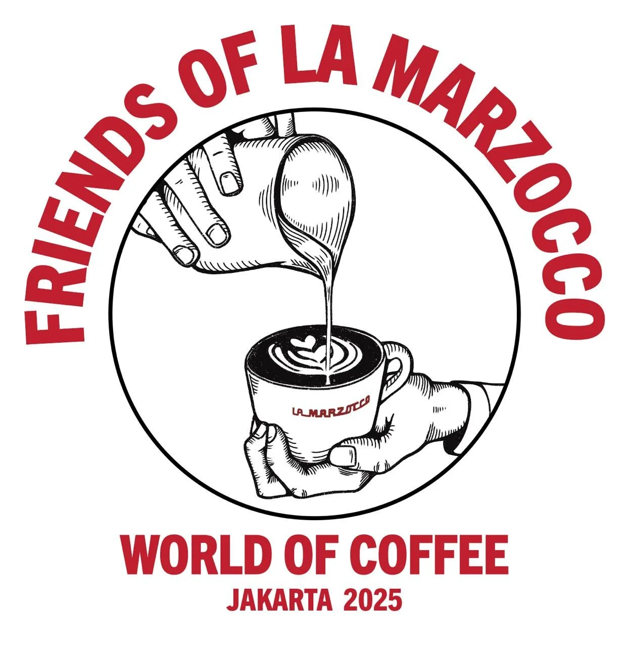
1st Draft of the initial idea they wanted to explore.

This resembled what I had in mind quite accurately. It’s from this show called Gravity Falls which I have no idea existed prior this photo.
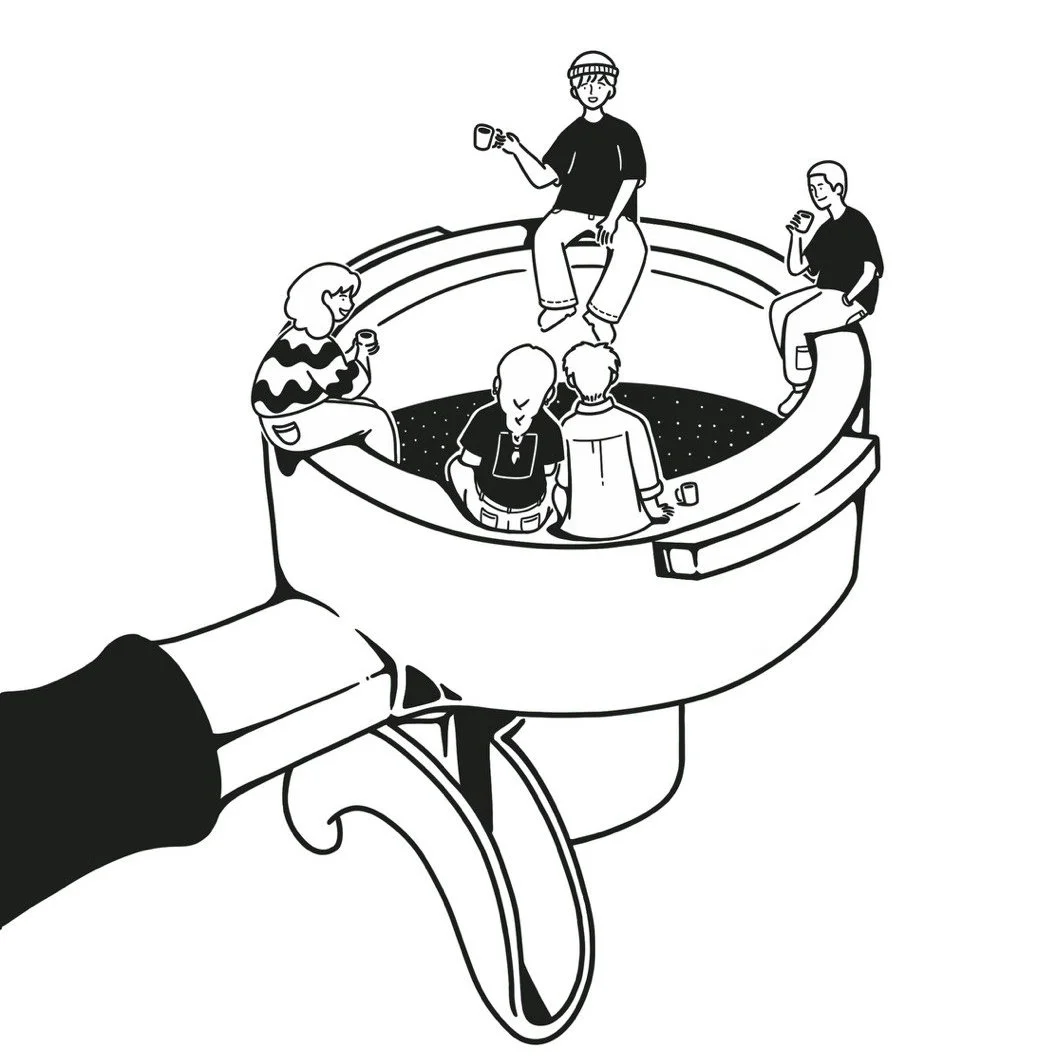
I joked that it looks like a design for a latte art competition….. and they agreed (to my relief). It felt impersonal and detached. Luckily, our agreement was that they also let me try and do my own thing.
For me, friends give a warm & fun vibe so I wanted to reflect that while also relating it to their brand. I tried sketching a few things but I kept coming back to a campfire setting.
I grew up on a lot of camping activities and I’ve enjoyed them with either beer or warm coffee in my hand. It’s always such a good time so maybe that’s why the idea kept nagging at me.
I don’t really have a specific drawing style so I either follow as per requested or decide for myself what would suit best. For this, I chose an art style that was clean and soft.
Instead of a campfire, I integrated their portafilter into the drawing as the base and worked from there.
Once I had the drawing mostly done, we got it approved.
Next up— non-negotiables:
the red text and font choice.
I had an idea to keep a more casual style using hand-written typography. I wasn’t so sure of it, felt a little cramped. Showed it to some friends for some fresh perspective and it generally got good feedbacks.
Ultimately, the design was rejected as it looked too visually loud. I was then advised to follow the requirements on the text. I struggled a bit for this part because I didn’t find the font to be cohesive with the art work.


A reference for the text in case none of you remember how comics used to look like in the newspaper.

My final suggestion was to use a comic font, to sort of mimic that it’s a drawing you’d find in the newspaper but keep their official font for the main header. I would have opted for an all-black palette but they actually wanted the red to symbolise Indonesia since that’s where W.O.C. was being held.
In the end, they wanted to stick with their original font options and this layout:

I honestly don’t think it’s my best work but it was fun to do. Maybe I could have done a more detailed drawing if I had more time but I think this was good for less than 2 weeks.
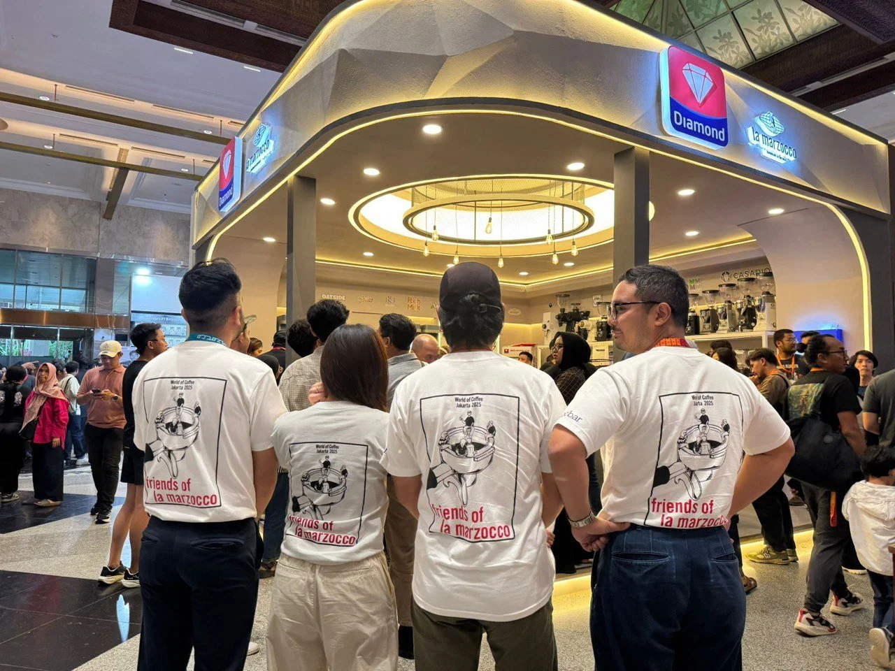
Some La Marzocco employees wearing the t-shirt!